Type safety
<Button style={{ font }}>
- fontSizelength
- fontWeight100 to 900
- fontFamilyfont stack
Your agent writes React. Hyper Elements turns it into emails, pages, PDFs and images, checks it in every client, and tells the agent how to fix what's wrong.
const out = await render(
  <Email>
    <TarnShipped />
  </Email>
);
// → tarn-shipped.html + .txt
Create, check, validate, fix. Around again until the content is right.
Your agent writes JSX
<Email style={{
  backgroundColor: "#f1f2f6",
  padding: 24
}}>
  <Heading>Orbit 2.0…
  <Button href="…">Try it
</Email>
See it in every client
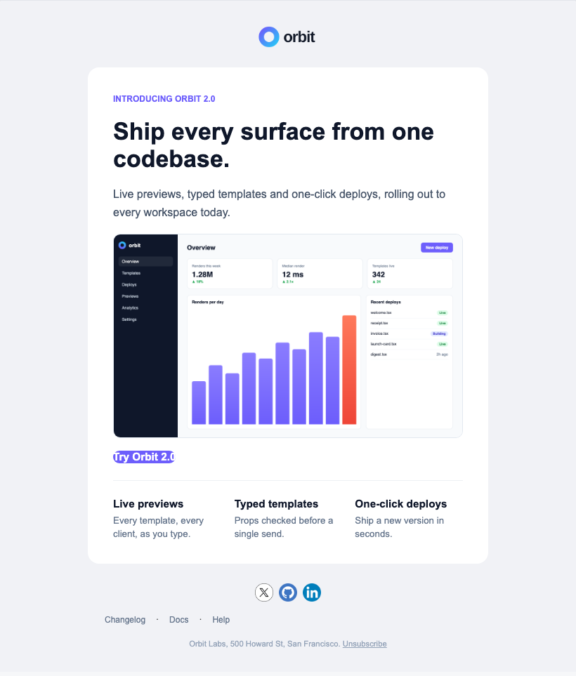
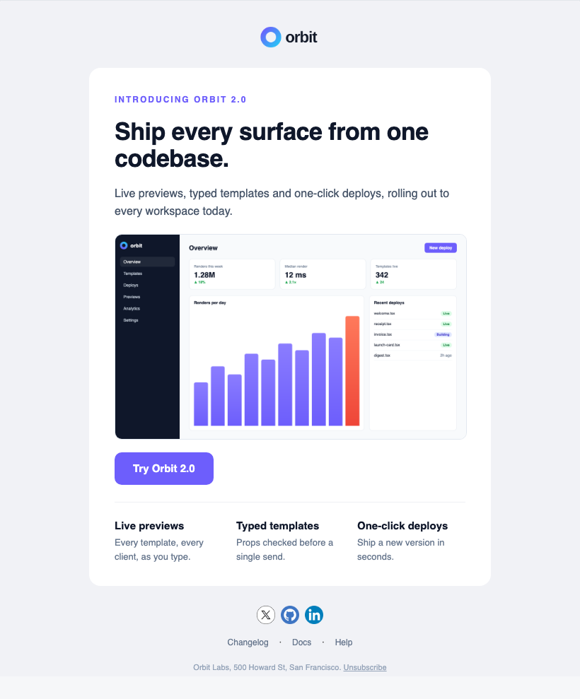
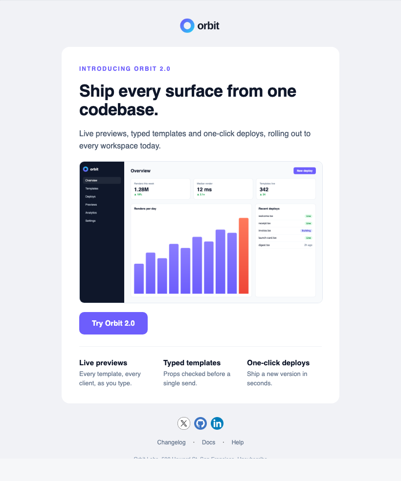
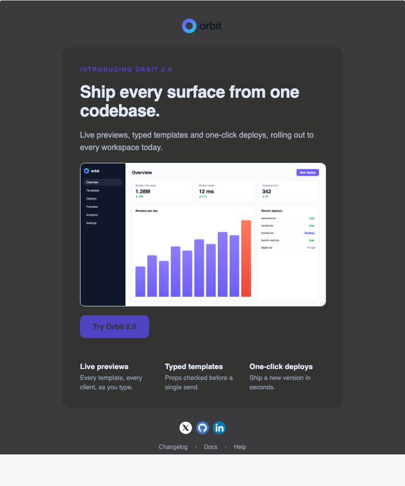
⚠ Outlook drops the button's padding
Errors, lint and spam score
style/unknown root.style.padding
"padding" isn't a style an Email takes: a root has no padding; put it on a Column (a card) or a Section (a band) inside it.
a11y/link-text "Try it" alone
best-practice/preview-text
deliverability/unsubscribe
+1.6 no unsubscribe link
+0.9 vague call to action
Each finding says how
- <Email style={{padding: 24}}>
+ <Email previewText="…">
+   <Section
+     style={{padding: 24}}>
-     <Button …>Try it
+     <Button …>Try Orbit 2.0
+     <Link href={unsubscribe}>
+   </Section>
↺ Around again until every check passes and every client looks right
Point your agent at the guide, then ask for what you want.
1Give it the guide
@node_modules/@hyper-elements/react/GUIDE.mdBefore writing a Hyper Elements template, read node_modules/@hyper-elements/react/GUIDE.md.Before writing a Hyper Elements template, read node_modules/@hyper-elements/react/GUIDE.md.Before writing a Hyper Elements template, read node_modules/@hyper-elements/react/GUIDE.md.npx skills add hyper-elements/hyper-elements
# or give it the docs: https://hyperelements.dev/llms.txtThe guide ships inside the package, written from the components' own definitions, so it matches the version you installed.
2Ask for what you want
Using Hyper Elements, write a launch email for our new feature in emails/launch.tsx. Run validate() and fix every finding, then show me outline().
A short template and its real HTML. Resize it: rows stack and phone styles apply.
import { Button, Column, Email, Heading, Text, Row, Section } from "@hyper-elements/react";
import type { ComponentProps } from "react";
import type { ButtonProps, ColumnProps } from "@hyper-elements/react";

const plans = [["Starter", "$0"], ["Pro", "$24"], ["Team", "$79"]];

export default function PlanPicker() {
  return (
    <Email style={{ backgroundColor: "#f1f2f6" }}>
      <Section style={{ padding: 20 }}>
        <Column style={card}>
          <Heading style={{ fontSize: 30 }}
            mobile={{ fontSize: 22 }}>
            Pick your Orbit plan
          </Heading>
          <Row style={{ gap: 12 }}>
            {plans.map(([name, price]) => (
              <Column key={name} style={plan}>
                <Text style={label}>{name}</Text>
                <Text style={amount}>{price}</Text>
              </Column>
            ))}
          </Row>
          <Button href="https://orbit.dev/plans" style={cta}
            hover={{ backgroundColor: "#4c3df0" }}>
            Choose a plan
          </Button>
        </Column>
      </Section>
    </Email>
  );
}

const card = { backgroundColor: "#fff", borderRadius: 12,
  padding: 28, gap: 18 };
const plan: ColumnProps["style"] = { backgroundColor: "#f4f3ff", borderRadius: 10,
  padding: 16 };
const label: ComponentProps<typeof Text>["style"] = { fontWeight: 700, color: "#6d5efc" };
const amount: ComponentProps<typeof Text>["style"] = { fontSize: 26, fontWeight: 700 };
const cta: ButtonProps["style"] = { backgroundColor: "#6d5efc", borderRadius: 8,
padding: [12, 22] };Hi <MergeTag name="first_name" /> → in the HTML and the text: Hi {{first_name}} Your provider's syntax with the mergeTag option.
[Orbit]
INTRODUCING ORBIT 2.0
SHIP EVERY SURFACE FROM ONE CODEBASE.
…
info email/outlook-degraded
borderRadius on this Column in classic Outlook: square corners
render(<Launch />)
  ===
render(<Launch />)  ✓

No clock, no randomness.
Safe to cache and prerender.
<Text>Hi {name}</Text> → Hi <img onerror=…> <Button href="javascript:…"> error prop/invalid isn't a link Elements will write
Every value escaped. No eval: runs under a strict CSP.
const ProductCard = component({
  type: "acme.ProductCard",
  props: { name: prop.text({ required: true }),
           photo: prop.image({ required: true }) },
  render: ({ name, photo }) => …,
});<ProductCard name="Linen shirt" /> error prop/required A acme.ProductCard needs "photo"
Named, typed blocks your team and your agents reuse, checked like the built-ins.